
Free Preparation Discussions
 MENU
MENU
WGU Applied Algebra (C957) Exam Questions
- Topic 1: Algebraic Expressions and Operations: Covers simplifying, evaluating, and solving algebraic expressions and equations using basic algebraic rules and operations.
- Topic 2: Linear Equations and Inequalities: Focuses on solving linear equations and inequalities and interpreting their meaning in real-world situations.
- Topic 3: Functions and Graphs: Explains how to analyze functions, interpret graphs, and understand relationships between variables.
- Topic 4: Exponential and Polynomial Models: Covers working with exponential and polynomial equations to model growth, decay, and other mathematical patterns.
- Topic 5: Applied Algebra Problem Solving: Focuses on applying algebra concepts to practical scenarios, including data interpretation and mathematical decision-making.
Free WGU Applied Algebra (C957) Exam Actual Questions
Note: Premium Questions for Applied Algebra (C957) were last updated On Oct. 10, 2026 (see below)
The number of new user accounts per day on a website is modeled by a decreasing exponential function. The graph of the function is shown.
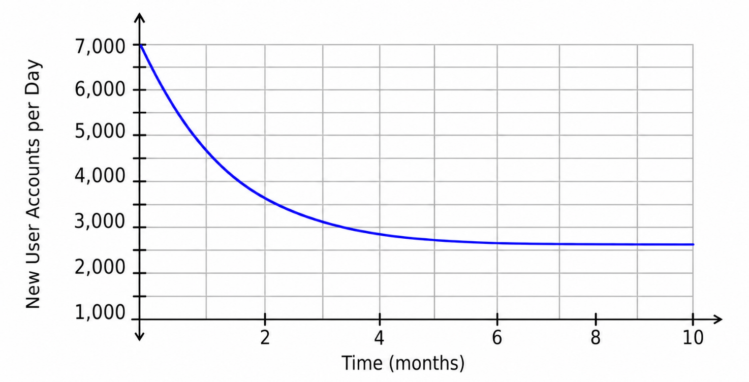
Which statement is justified considering the location of the horizontal asymptote?
The graph shows a decreasing exponential function.
The horizontal axis represents:
The vertical axis represents:
The graph starts near new user accounts per day and decreases over time. However, it does not decrease toward . Instead, the graph levels off near a horizontal value around:
This horizontal value is the horizontal asymptote.
A horizontal asymptote shows the long-term value the function approaches. Since the asymptote is above , the model predicts that the number of daily new user accounts approaches a positive value, not zero.
So the justified statement is:
The population of fish in a lake is changing according to the function
where is the number of months since the beginning of the year and is the fish population at time .
Which interpretation of the rate of change is correct?
The function is:
This is a linear function in the form:
where:
and
In this function:
The negative sign means the fish population is decreasing.
The number tells us the amount of decrease per month.
So the fish population is decreasing by:
The value is not the rate of change. It represents the starting fish population at the beginning of the year, when :
Therefore, the correct interpretation is:
So the correct answer is:
The scatterplot shows data on the number of visitors to a resort each week since opening. A regression function is graphed with . The predicted number of visitors after weeks is .
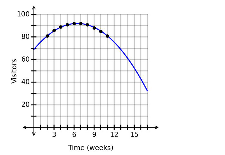
Is this prediction appropriate?
The regression model has:
This means the model is a very strong fit for the data because is close to .
However, a strong value does not automatically make every prediction appropriate. We also have to check whether the -value is within a reasonable extrapolation range.
The data shown on the graph appear to extend to about:
The prediction is for:
This is far beyond the observed data range. Even though the model fits the known data very well, predicting too far beyond the data can be unreliable.
The correct statement is that the value indicates a strong fit, but is more than of the range beyond the maximum observed value.
Therefore, the correct answer is:
The growth of an animal population is shown in the graph. The instantaneous rate of change at point is .
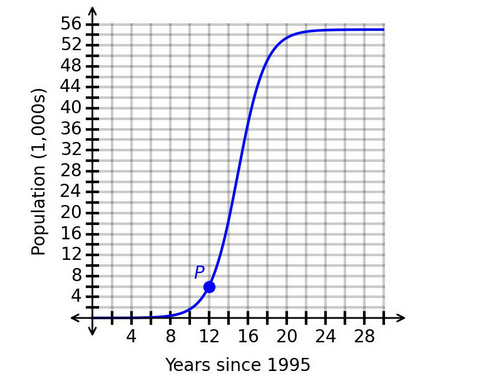
Which interpretation of the instantaneous rate of change is correct?
The graph shows population in thousands, and the horizontal axis represents:
Point is located at approximately:
Since represents years since 1995:
So point corresponds to the year:
The instantaneous rate of change at point is:
Because the vertical axis is measured in thousands, this means:
Convert thousands to actual animals:
So in 2007, the population was increasing by approximately:
The populations, in thousands, of two towns are shown in the graph, where the horizontal axis measures the time in years.
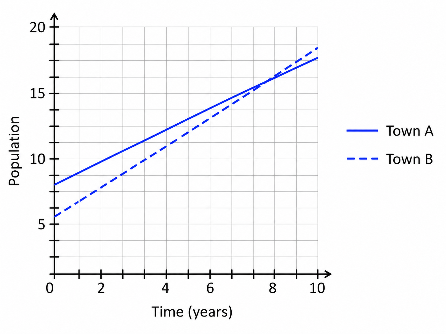
Which town's population is growing at a faster rate?
This question asks which town's population is growing at a faster rate.
Since both population graphs are straight lines, we compare their slopes.
The slope of a line represents the rate of change:
From the graph:
Town A starts at about thousand people and increases at a rate of about thousand people per year.
Town B starts at about thousand people and increases at a rate of about thousand people per year.
Even though Town A starts with a larger population, the question asks about the growth rate, not the starting population.
Compare the rates:
So Town B is growing faster than Town A.
- Select Question Types you want
- Set your Desired Pass Percentage
- Allocate Time (Hours : Minutes)
- Create Multiple Practice tests with Limited Questions
- Customer Support
Joshua Allen
19 days agoLayla Qureshi
25 days agoKenji Nakamura
2 months agoYan Yamamoto
2 months agoVan Lee
3 months agoJin Yang
3 months agoValentina Petit
4 months ago