Free Preparation Discussions
ServiceNow CIS-PA Exam Questions
- Topic 1: Architecture and Deployment: This domain covers the foundational components of the Performance Analytics solution and the proper deployment sequence in ServiceNow environments.
- Topic 2: Configure Indicators and Indicator Sources: This domain addresses creating and configuring indicators (performance metrics), including source conditions, fact tables, indicator types, properties, and aggregation scripts.
- Topic 3: Configure Breakdowns and Breakdown Sources: This section covers setting up breakdowns to analyze indicators across different dimensions, including breakdown mappings, matrices, exclusions, scripted mappings, and bucket groups.
- Topic 4: Data Collection: This domain explains how Performance Analytics gathers and processes data, including collection flow, configuration properties, and troubleshooting collection issues.
- Topic 5: Data Visualization: This section focuses on presenting data through widgets, interactive filters, appropriate visualizations, dashboards, and analyzing data using Analytics Hub and KPI Details.
- Topic 6: Administration and Solutions: This domain covers administrative tasks using the Admin Console and accelerating deployment with pre-built Content Packs. Perform Diagnostics and Troubleshooting This section addresses identifying and resolving issues using Spotlight diagnostic tools to monitor system health and performance.
Free ServiceNow CIS-PA Exam Actual Questions
Note: Premium Questions for CIS-PA were last updated On Jun. 11, 2026 (see below)
There is a Summed Duration of wait time Indicator that stores duration in milliseconds.
Which action accurately configures the displayed duration in hours without creating a separate Formula Indicator?
Platform Analytics supports unit conversion for duration-based indicators through the Unit field on the Indicator record. When an indicator stores duration values (such as milliseconds), setting the Unit to Hours automatically converts and displays the values correctly without modifying the underlying data or recollecting scores.
Using formulas or scripts is unnecessary and discouraged when a built-in unit conversion is available. The Formula box is intended for mathematical aggregation logic, not unit conversion. ServiceNow documentation explicitly states that duration indicators should rely on the Unit setting to control how values are displayed, making option A the correct and supported approach.
What is the purpose of using a Bucket Group?
A Bucket Group in Platform Analytics is used to group large sets of numeric or time-based values into a smaller, more meaningful number of ranges. Common examples include grouping ages into ranges (0--5 days, 6--10 days), durations into bands, or hours of the day into segments. This simplifies analysis and improves dashboard readability by reducing excessive breakdown elements.
Bucket Groups do not log incidents, manage roles, or control integrations. Instead, they support analytics by enabling structured classification of non-categorical data. ServiceNow documentation clearly positions Bucket Groups as a mechanism for transforming raw numeric or duration data into consumable breakdowns, making option B the correct answer.
Which Indicator should be excluded from a Historic Data Collection because its scores cannot be accurately collected?
Historic Data Collection is designed to accurately reconstruct past indicator scores based on historical records. Indicators that rely on calculated age values, such as summed age of open problems, cannot be accurately reconstructed because age is a time-relative value that depends on the exact moment of calculation.
Count-based indicators (options A, B, and D) can be recalculated historically by evaluating record states at specific points in time. However, summing age values requires knowing the precise age of each record at each historical interval, which is not reliably reproducible. ServiceNow documentation explicitly warns against using historic data collection for age-based and duration-sum indicators, making option C the correct exclusion.
Which application helps to obtain insights on new and returning platform users and their navigation patterns?
User Experience Analytics is the application designed to analyze user behavior, including new versus returning users, session frequency, navigation paths, page views, and interaction patterns across the ServiceNow platform. It provides insights into how users engage with the platform and helps organizations optimize usability, adoption, and performance.
Responsive Dashboards and Next Experience Dashboards are visualization and UI frameworks, not behavioral analytics tools. Platform Analytics Workspace focuses on KPI monitoring and process performance, not clickstream or navigation behavior. ServiceNow documentation clearly positions User Experience Analytics as the solution for understanding how users interact with the platform, making option D the correct answer.
What determines the color of the score in a Score widget?
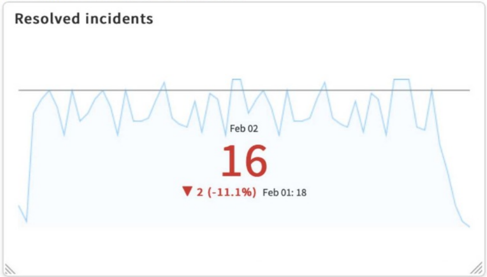
In ServiceNow Platform Analytics, the color of the score displayed in a Score widget is determined by the Indicator's relationship to its target in combination with the Direction setting (Maximize or Minimize) of the Indicator. This behavior is part of the KPI evaluation logic and is consistent across dashboards and KPI Details.
When an indicator has a defined target, Platform Analytics compares the current score against that target. Based on whether the indicator is configured to maximize (higher is better) or minimize (lower is better), the platform automatically assigns a visual status---such as green (on track), yellow (warning), or red (off track). This status directly controls the color of the score value shown in the widget.
Chart colors, field styles, or widget-specific settings do not influence the score color. Those options may affect line charts or visual styling, but not KPI status coloring. ServiceNow documentation clearly states that KPI status and score coloring are driven by target evaluation logic, making option A the correct and verified answer.
- Select Question Types you want
- Set your Desired Pass Percentage
- Allocate Time (Hours : Minutes)
- Create Multiple Practice tests with Limited Questions
- Customer Support
Matthew Morgan
11 days agoGeorge Nelson
24 days agoMark Martinez
2 months agoNancy Garcia
1 month agoTimothy Campbell
28 days agoDonald Thomas
25 days agoDonald Edwards
22 days agoAaron
2 months agoCasie
2 months agoSharen
3 months agoTamekia
3 months agoAshleigh
3 months agoRosio
3 months agoElfriede
4 months agoWillow
4 months agoAdaline
4 months agoAltha
4 months agoDetra
5 months ago