
Free Preparation Discussions
 MENU
MENU
Salesforce Analytics-DA-201 Exam Questions
- Topic 1: Connect To and Transform Data: This domain focuses on connecting to various data sources such as files, databases, and published sources, while deciding between live and extract connections. It also covers preparing, cleaning, transforming, and organizing data using Tableau features and Tableau Prep to ensure it is ready for accurate analysis.
- Topic 2: Explore and Analyze Data: This section covers creating calculations, applying filters, parameters, and structuring data to explore insights effectively. It also includes advanced analysis techniques such as table calculations, LOD expressions, forecasting, and geographic mapping to derive meaningful patterns and trends.
- Topic 3: Create Content: This domain involves building visualizations like charts, dashboards, and stories to present data insights clearly. It also focuses on adding interactivity, formatting, and designing responsive dashboards to enhance user experience and data communication.
- Topic 4: Publish and Manage Content on Tableau Server and Tableau Cloud: This section covers publishing workbooks, data sources, and flows to Tableau Server or Cloud for sharing and collaboration. It also includes managing content through scheduling refreshes, setting permissions, and creating alerts, subscriptions, and custom views.
Free Salesforce Analytics-DA-201 Exam Actual Questions
Note: Premium Questions for Analytics-DA-201 were last updated On Sep. 30, 2026 (see below)
You have the Mowing two tables that contains data about the books in a library.
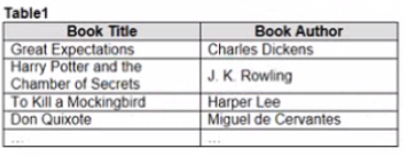
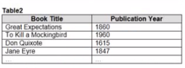
Both tables are incomplete so there are books missing from the tables.
You need to combine the tables. The solution must ensure that all the data is retained
Which type of join should you use?
To combine the two tables that contain data about books in a library and ensure that all the data is retained, you should use a full outer join. A full outer join is a type of join that returns all rows from both tables, regardless of whether there is a match or not. If there is no match, null values are filled in for the missing fields.
To perform a full outer join, you need to do the following steps:
Connect to both tables as your data sources in Tableau. You can use either live or extract connections.
Drag one table to the canvas and drop it on top of another table. This will create a join between them based on a common field.
Click on the join icon between the tables and select Full Outer Join from the drop-down list. This will change the join type to full outer join and show all rows from both tables.
Optionally, you can add or remove join clauses by clicking on Add or Remove buttons next to each clause. You can also change or rename fields by clicking on them.
When combining two datasets that are both incomplete and where it's important to retain all data from both sources, a full outer join is appropriate. This type of join ensures that all records from both tables are included in the combined dataset, even if there are no matching records in the other table.
You need the top 10 values to appear in a different color. The lop 10 values must be colored dynamically.
What should you do?
You have the following map.
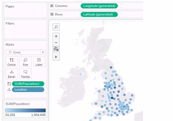
You need the map to appear as shown in the following visualization.
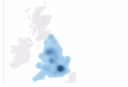
What should you do?
The question presents a scenario where a geographic map visualization in Tableau needs to be transformed from a series of discrete circles representing data points to a density map visualization. The density map shows concentrations of data points with a gradient of color, where denser areas are indicated by a darker color.
Here's the explanation for each option:
A . Change the mark type to Density: This is the correct answer because changing the mark type to 'Density' in Tableau creates a density map, which displays the concentration of data points with a color gradient. This is exactly what is needed to achieve the visual effect shown in the second image, where regions with a higher concentration of data points are represented by darker shades.
B . Drag Location to Size on the Marks card: This option would adjust the size of the marks based on the number of locations, which is not relevant to creating a density map. It would result in varying sizes of circles, not a continuous gradient.
C . Change the mark type to Map: The visualization is already using a map. This option would not change the visualization to the desired density map.
D . Drag Population to Size on the Marks card: This would change the size of the circles based on the population values, making some circles larger and others smaller. This is not how a density map is created, which uses color intensity rather than size to show concentration.
E . Change the opacity to 75%: Changing the opacity would affect the transparency of the marks on the map but would not transform the visualization into a density map.
To achieve the visualization shown in the second image, the mark type must be changed to 'Density,' which will produce a heat map-like effect where the color intensity represents the concentration of data points. Therefore, the correct answer is A. Change the mark type to Density.
To create a density map from a scatter plot of data points, you would change the mark type to Density. This mark type allows you to visualize the concentration of data points in an area, which can be useful for identifying clusters or patterns in geospatial data.
You have a large data source that contains more than 10 million rows. Users can filter the rows by a field named Animal.
The following is a sample of the data.

You want to improve the performance of the views by including only animals of a particular type.
To which filter should you add the Type field on the worksheet?
You have two tables named Employeelnfo and DepartmentInfo. Employeelnfo contains four fields named Full Name, Department ID, Start Date, and Salary.
DepartmentInfo contains four fields named Department Name, Size, Department ID, and VP.
You want to combine the tables to meet the following requirements:
. Each record in Employeelnfo must be retained in the combined table.
. The records must contain the Department Name, Size, and VP fields.
* Every record must have a full name.
Which type of join should you use?
To combine the tables and meet the requirements, you should use a left join. A left join will keep all the records from the left table (Employeelnfo) and match them with the records from the right table (DepartmentInfo) based on the common field (Department ID). If there is no matching record in the right table, the fields from the right table will be null. This way, you will retain all the records from Employeelnfo, and also include the Department Name, Size, and VP fields from DepartmentInfo. Every record will have a full name because it is a field from the left table. A left join will look like this:
Join Your Data - Tableau
Join Types in Tableau
- Select Question Types you want
- Set your Desired Pass Percentage
- Allocate Time (Hours : Minutes)
- Create Multiple Practice tests with Limited Questions
- Customer Support
Elizabeth Bailey
9 days agoJennifer Wilson
29 days agoJustin Anderson
1 month agoEric Nelson
2 months agoKimberly Lopez
2 months agoJoseph Jackson
3 months agoBrenda Brown
3 months agoBrenda Lee
4 months agoJason Baker
4 months agoGerald Garcia
5 months agoBrenda Stewart
5 months agoRachel Baker
5 months agoJason Martin
5 months agoThomas Collins
5 months agoGeorge Reed
5 months agoMirta
6 months agoAnnice
6 months agoCandra
7 months agoJennie
7 months agoEmogene
7 months agoNa
7 months agoSherron
8 months agoGlory
8 months agoGregoria
8 months agoJose
8 months agoToshia
9 months agoTammi
9 months agoTanja
9 months agoRosio
9 months agoRebbecca
10 months agoLizette
10 months agoLazaro
10 months agoJesusa
10 months agoElvera
11 months agoEsteban
11 months agoIsabelle
11 months agoKeena
11 months agoKanisha
12 months agoFlorinda
12 months agoAvery
1 year agoVal
1 year agoAlishia
1 year agoAmos
1 year agoTamar
1 year ago