Free Preparation Discussions
Microsoft DP-600 Exam Questions
Free Microsoft DP-600 Exam Actual Questions
Note: Premium Questions for DP-600 were last updated On Jul. 09, 2026 (see below)
You have Fabric tenant.
You need to create a sematic model that delivers fast report rendering, minimizes query latency, and maximizes flexibility for DAX calculations.
Which storage mode should you select?
You have a Fabric workspace named Workspace1 that is assigned to a newly created Fabric capacity named Capacity1.
You create a semantic model named Model1 and deploy Model1 to Workspace1.
You need to publish changes to Model1 directly from Tabular Editor.
What should you do?
In Microsoft Fabric, semantic models (formerly datasets) can be managed using external tools like Tabular Editor. To push or publish changes directly to a Fabric workspace from Tabular Editor, the workspace must support XMLA endpoint connectivity with read-write access.
Explanation of Each Option
A . For Workspace1, enable Git integration.
Git integration allows source control and versioning of items in a Fabric workspace. It is intended for lifecycle management of artifacts and does not provide the connectivity required for Tabular Editor to publish semantic model changes.
B . For Workspace1, create a managed private endpoint.
A managed private endpoint provides secure connectivity between Fabric and external data sources. It is not related to the ability to publish semantic models through XMLA.
C . For Model1, enable external sharing.
External sharing governs who can access the model outside the organization. This does not affect publishing workflows from developer tools.
D . For Capacity1, set XMLA Endpoint to Read Write.
This is the correct choice. The XMLA endpoint provides a programmatic connection point for external tools like Tabular Editor. By default, the XMLA endpoint is enabled only in read-only mode. Changing the setting to Read Write allows developers to push changes, update metadata, and deploy semantic models directly from Tabular Editor into the Fabric workspace.
Summary
To publish changes to a Fabric semantic model using Tabular Editor, the XMLA endpoint of the assigned capacity must be set to Read Write. Without this configuration, Tabular Editor can only connect in read-only mode and cannot deploy updates.
Reference
Use the XMLA endpoint in Microsoft Fabric
Manage capacities in Microsoft Fabric
You have a Fabric workspace that contains a DirectQuery semantic model. The model queries a data source that has 500 million rows.
You have a Microsoft Power Bl report named Report1 that uses the model. Report! contains visuals on multiple pages.
You need to reduce the query execution time for the visuals on all the pages.
What are two features that you can use? Each correct answer presents a complete solution.
NOTE: Each correct answer is worth one point.
User-defined aggregations (A) and query caching (C) are two features that can help reduce query execution time. User-defined aggregations allow precalculation of large datasets, and query caching stores the results of queries temporarily to speed up future queries. Reference = Microsoft Power BI documentation on performance optimization offers in-depth knowledge on these features.
You have a Fabric workspace named Workspace1 that contains the following items:
A warehouse named Warehouse1
A semantic model named Model1
An interactive report named Report1
You need to allow a user named User1 to access a single table in Warehouse1. The solution must follow the principle of least privilege.
What should you do first?
Requirement
Fabric workspace: Workspace1
Contains: Warehouse1, Model1, Report1
Task: Allow User1 to access a single table in Warehouse1.
Must follow principle of least privilege grant only the exact permissions required.
Step 1: Evaluate Options
A . Assign object level permissions to User1 for Warehouse1.
In Fabric warehouses, you can grant permissions at the object level (table, schema, or column).
If the requirement is access to only one table, the correct approach is to grant SELECT permissions on that specific table.
This satisfies least privilege.
Correct.
B . Assign the db_datareader role to User1 for Warehouse1.
db_datareader provides read access to all tables in the database/warehouse.
This violates least privilege.
Not correct.
C . Share Warehouse1 with User1.
Sharing grants access to the whole warehouse.
Too broad, not least privilege.
Not correct.
D . Assign the Viewer role to User1 for Workspace1.
Viewer role allows seeing all items in the workspace (warehouse, model, reports).
This would expose more than the single table.
Not correct.
Step 2: Correct Action
Use object-level permissions:
GRANT SELECT ON dbo.TableName TO [User1];
This ensures User1 can only query that specific table, nothing else.
Reference
Manage object-level security in Microsoft Fabric warehouses
You have a Fabric tenant that contains a semantic model named Model1. Model1 uses Import mode. Model1 contains a table named Orders. Orders has 100 million rows and the following fields.
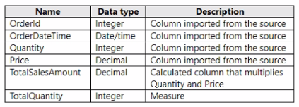
You need to reduce the memory used by Model! and the time it takes to refresh the model. Which two actions should you perform? Each correct answer presents part of the solution. NOTE: Each correct answer is worth one point.
To reduce memory usage and refresh time, splitting the OrderDateTime into separate date and time columns (A) can help optimize the model because date/time data types can be more memory-intensive than separate date and time columns. Moreover, replacing TotalSalesAmount with a measure (D) instead of a calculated column ensures that the calculation is performed at query time, which can reduce the size of the model as the value is not stored but calculated on the fly. Reference = The best practices for optimizing Power BI models are detailed in the Power BI documentation, which recommends using measures for calculations that don't need to be stored and adjusting data types to improve performance.
- Select Question Types you want
- Set your Desired Pass Percentage
- Allocate Time (Hours : Minutes)
- Create Multiple Practice tests with Limited Questions
- Customer Support
Timothy Lee
12 days agoBetty Collins
17 days agoOlivia Rogers
1 month agoDennis Robinson
2 months agoWilliam Bailey
2 months agoKimberly Smith
3 months agoRobert Williams
3 months agoBetty Flores
2 months agoHarold Adams
3 months agoSandra Nguyen
2 months agoSharon Peterson
2 months agoAhmed
3 months agoDeonna
4 months agoJesus
4 months agoJerlene
4 months agoLorean
4 months agoKayleigh
5 months agoWilda
5 months agoHarley
5 months agoKimbery
5 months agoJosefa
6 months agoJade
6 months agoNathalie
6 months agoDustin
6 months agoDaren
7 months agoJennifer
7 months agoRaymon
7 months agoRoslyn
7 months agoCiara
8 months agoAileen
8 months agoMollie
8 months agoLinsey
8 months agoLayla
9 months agoDick
9 months agoBette
9 months agoTerrilyn
9 months agoStefania
10 months agoBeckie
10 months agoKendra
10 months agoRashida
10 months agoJudy
1 year agoDeane
1 year agoCarlee
1 year agoJacquelyne
1 year agoAndra
1 year agoLeandro
1 year agoGermaine
2 years agoAdela
2 years agoMerrilee
2 years agoReita
2 years agoTyisha
2 years agoLaquanda
2 years agoLeonor
2 years agoLeota
2 years agoLachelle
2 years agoFletcher
2 years agoMarla
2 years agoKrystal
2 years agoJacki
2 years agoValene
2 years agoLauran
2 years agoKaron
2 years agoMarge
2 years agoTamekia
2 years agoMary
2 years agoStephaine
2 years agoLing
2 years agoJonelle
2 years agoKerry
2 years agoNobuko
2 years agoalison
2 years agoAlex
2 years agopereexe
2 years agokorey
2 years agoAsuncion
2 years agoAlexas
2 years ago